Logo
Woz logo variants for different backgrounds.
Black Logo

White Logo

Mascot
The Woz Wizard - our pixelated companion representing AI-powered app building.
Full Wizard
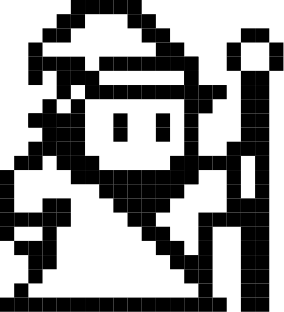
Wizard Avatar
Wizard Avatar (Cropped)
Full Wizard (Dark Mode)
Wizard Avatar (Dark Mode)
Brand Green Wizard

image-rendering so the chunky pixels stay crisp at any size; never resample-smooth it. File: wizard-green.png.
Wizard Avatar (Cropped, Dark Mode)
Colors
Woz brand colors and system palette.
Brand Colors
RGB: 147, 232, 73
Usage: Primary brand color, accents, CTAs. Not accessible for text on light backgrounds.
RGB: 90, 158, 31
Contrast: 4.51:1 on white (WCAG AA ✓)
Usage: Links, interactive text, accessible CTAs. Recommended for text and links.
System Colors
Utility Colors
RGB: 141, 140, 209
Usage: Section labels, metadata, secondary accent
RGB: 255, 0, 0
Usage: Negative indicators, alerts
RGB: 0, 209, 31
Usage: Positive indicators, success states, growth metrics
Typography
Saira font family is used throughout the site for a consistent, modern monospace aesthetic.
Build apps that earn
• Scales with viewport: 8% of screen width
• Maximum: 6rem (72pt) on large screens
Get it done, all in one
• Scales with viewport: 4% of screen width
• Maximum: 2.75rem (44pt) on large screens
Connect live data
Multi-currency support
Woz is the AI-enabled mobile app builder for business builders
It's never been easier to build a product and launch a secondary income stream.
Access external data sources and APIs to power your app with real-time information.
Everything in Pro, plus dedicated account manager and expert development support.
"Finally, a tool that doesn't compromise on design. My clients love it."
Icons
Icon set used throughout the site for visual communication.
Icon Sizes

Usage: Inline text, tight spaces
Usage: UI elements, buttons
Usage: Feature sections, headers
Feature Icons


Social Media Icons
Section Labels
Red technical callouts for section identification
Interactive Demo TRY IT
Variations
Chat Box
Interactive input component for app idea submission with animated wizard avatar
Interactive Demo TRY IT
Woz
Testimonials
Customer testimonial cards
Interactive Demo TRY IT
"Launched my fitness coaching app in 3 days. Already at $2k MRR."
Variations
"Finally, a tool that doesn't compromise on design."
Feature Table
Comparison table for features
Interactive Demo TRY IT
Check Marks
Icon Cards
Versatile cards with icons for features, integrations, or any content
Interactive Demo TRY IT
Connect live data
Access external data sources and APIs to power your app with real-time information
States
Study usage
Gather analytics and user insights before you launch to validate your market
Study usage
Gather analytics and user insights before you launch to validate your market
Code Features
Code quality feature rows
Interactive Demo TRY IT
Features display with grey-900 background at 80% opacity, grey-900 border, and fade-in animation
Clean, well-organized code that developers can understand and confidently adjust.
Production-grade code with built-in best practices like strict type safety and proper secrets management
Code that's easy to extend, review, and improve over time so that you can add features without major rewrites.
Code Tools
Workspace logos without labels or hover states


Case Study Card
Customer success story showcase
Interactive Demo TRY IT
"We launched our meditation app on Woz and built a community of 10,000 beta users."
Tweet Cards
Influencer insights and playbooks
Interactive Demo TRY IT
Just hit $10k MRR with my side project app. Built it in 2 weeks, launched on Product Hunt, now it's my full-time income.
My playbook for App Store speed runs: 1) Build MVP in public 2) Get 50 beta testers early 3) Perfect your screenshots first.
States
Focus on solving one problem really well, charge from day one, and ship fast.
Focus on solving one problem really well, charge from day one, and ship fast.
Plan Cards
Pricing tier cards
Interactive Demo TRY IT
Free
- Install in seconds — no account required
- $100/mo in free Claude Code savings
- Full plugin access
Pro
- Unlimited Claude Code savings
- All enhanced coding tools
- Priority support
Enterprise
- Everything in Pro
- Team management & SSO
- Dedicated support
States
Free
- Feature 1
Pro
- Feature 1
Stock Ticker
Real-time stock price display
Interactive Demo TRY IT


States
 SPOT
$312.80
+4.23%
SPOT
$312.80
+4.23%
 SNAP
$11.20
-2.14%
SNAP
$11.20
-2.14%
Avatar
User initials display
Interactive Demo TRY IT
Examples
Images
Visual treatment styles for images in sections
Light Section Treatment
Used in light backgrounds. Example: Global reach section

<div class="global-visual">
    <img src="image.jpg" alt="Description">
</div>

.global-visual {
    border: var(--border-width) solid var(--border-color);
    background: var(--color-grey-100);
    border-radius: 4px;
}
Dark Section Treatment
Used in dark backgrounds with grainy texture. Example: For developers section

<div class="code-export-visual">
    <img src="eleven-labs-grainy.png" alt="Code workspace" style="width: 100%; height: 100%; object-fit: cover;">
</div>

.code-export-visual {
    border: var(--border-width) solid var(--color-grey-700);
    background-color: var(--color-grey-800);
    border-radius: 4px;
    overflow: hidden;
    height: 400px;
}
Integration Logos
Integration partner logos used in the automated integrations section carousel

















<div class="integration-logos-carousel">
    <div class="integration-logos-track">
        <img src="integration-logos-batch-1/stripe@3x.png" alt="Stripe" class="integration-logo">
        <img src="integration-logos-batch-1/open ai@3x.png" alt="OpenAI" class="integration-logo">
        <!-- Additional logos... -->
    </div>
</div>

.integration-logo {
    width: 48px;
    height: 48px;
    object-fit: contain;
    border-radius: 10px;
    border: var(--border-width) solid var(--color-grey-100);
    flex-shrink: 0;
}
App Revenue Card
Display app metrics including icon, name, category, publish date, and earnings
Interactive Demo TRY IT
Examples
Dark Background Variant
For use in dark sections like the code/developer sections
Code
For dark backgrounds, wrap the card in a .section-code container
<!-- Component Placeholder -->
<div class="app-revenue-card-placeholder"
     data-icon="app icons/spotify.png"
     data-name="Spotify"
     data-description="Music streaming"
     data-date="Published Oct 2008"
     data-revenue="$45.2k"></div>

<!-- Load component JavaScript -->
<script src="components/app-revenue-card.js"></script>

<!-- Dark Background Variant -->
<div class="section-code">
    <div class="app-revenue-card-placeholder"
         data-icon="app icons/uber.png"
         data-name="Uber"
         data-description="Ride sharing"
         data-date="Published May 2009"
         data-revenue="$127k"></div>
</div>
Install Terminal
Two-line copyable terminal block used as the primary install CTA on the homepage. Brand-green hairline border, slow breathing glow, and a small COPY button in the header. Variant .hero-install-terminal turns the glow on; the base .sc-terminal is the single-line variant used on the savings-check section.
Hero variant (multi-line, breathing glow)
$claude plugin marketplace add WithWoz/wozcode-plugin
$claude plugin install woz@wozcode-marketplace
<div class="sc-terminal hero-install-terminal" onclick="copyHeroCmd()">
  <div class="sc-term-header">
    <span class="sc-term-dot sc-term-dot-red"></span>
    <span class="sc-term-dot sc-term-dot-yellow"></span>
    <span class="sc-term-dot sc-term-dot-green"></span>
    <span class="sc-term-title">terminal</span>
    <button class="sc-term-copy" id="hero-copy-btn" type="button"
      onclick="event.stopPropagation(); copyHeroCmd()">COPY</button>
  </div>
  <pre class="sc-term-body" id="hero-cmd"><span class="sc-term-line"><span class="sc-term-prompt">$</span><span class="sc-cmd-bin">claude</span> ...</span>
<span class="sc-term-line">...</span></pre>
</div>
Single-line variant (no glow)
$curl -fsSL https://wozcode.com/savings-check.js | node -
Pills & Badges
Small inline highlight chips. Used to call out specific savings amounts, optional steps, and the most important word in a feature bullet.
Savings pill (.pricing-card-pill)
Highlights a discrete benefit on the Free pricing card. Wraps to two lines on narrow widths because the parent card maxes out at ~360px.
<div class="pricing-card-pill">
  <span class="pricing-card-pill-star">★</span>
  <span class="pricing-card-pill-text">
    <strong>$200/mo in savings</strong> with a corporate email
  </span>
</div>
Optional badge (.step-optional)
Used on docs install steps that are optional. Purple accent (--color-accent-purple) so it doesn't compete with the green CTA hierarchy.
<div class="step-label">
  Log in to your Woz account
  <span class="step-optional">Optional</span>
</div>
Inline feature highlight (.pricing-feature-highlight)
Inline brand-green bold inside a regular feature bullet — used to make the headline benefit pop without adding new chrome.
Install in seconds — no account required
$100/mo in free Claude Code savings (no account needed)
Full plugin access on the free plan
Sign in (optional) for a savings dashboard
<li>
  <strong class="pricing-feature-highlight">
    $100/mo in free Claude Code savings
  </strong>
  (no account needed)
</li>